
Bill.com and divvy-content design
Bill.com is an online B2B payment platform that helps manage accounting and finances for small and medium-sized businesses.
Designing content in the FinTech industry presents various challenges. Not only do we have to navigate government and financial regulations, but we also have the tall task of demystifying complex systems of payment processing.
Add Vendors flow
Role: Senior Content Designer. Worked on a team with a product designer, PM, and engineering leads.
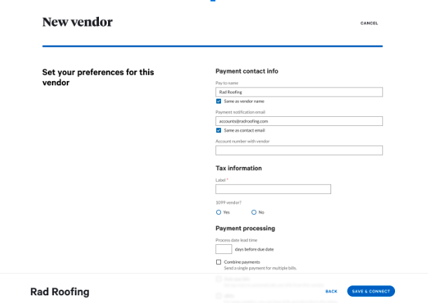
Adding vendors is one of the most common tasks our users on Bill.com take action on. In most cases, this is a Staff Accountant, or some power user that’s able to add businesses to their Bill.com network in order to send payments to them.
From a business perspective, the more vendors that are on Bill.com, the larger the user base, and the more potential growth opportunities there are for us.
The process of adding new vendors to your list of connections meant that you can pay, receive, and get updates on payments easier and much faster.
The problem
The previous add vendor flow left a lot to be improved. Research and data showed that users on our site were abandoning the flow, not filling all details correctly, and generally having issues figuring how how to add vendors to their network. There were a lot of unknown fields to fill out, a lot of information to read through, and it was generally time-consuming.
Previous experience
This page scrolled further down
So we did some research on the flow, and some of the initial impressions we had as a team were as followed:
Users were slow to fill out the details.
They struggled with some terminology.
Some users didn’t realize they have to scroll down for more information.
Setting preferences is a different experience than adding a new vendor. The content isn’t mapping to the user’s mental model for what we’re seeking.
The page (which scrolls down further) is quite a bit of cognitive overload, causing users hesitation and prevents them from making an informed decision consistently and repeatedly.
So the team took some feedback and we decided to go with a different approach.
I received some inspiration from TurboTax, with the idea to create a more step by step walk through so users can simplify the decision making, with the hypothesis that this would reduce the time to completion, and increase completion rates.
I also wanted to make it more conversational, and less “formal” in terms of having a form to just fill out.
Here was the initial draft:

We thought that in this case, simplifying the flow didn’t necessarily mean creating less screens. Quite the opposite. In this case, we hypothesized that by going from 2 screens to 3, would actually simplify it by making the content more contextual to where the users mental model is.
So we thought this was a good approach, but testing showed that people still struggled with the content and design here.
Further analysis:
Including the payment method in the same screen as inviting the vendor to sign up (via email) is confusing, and causes the user to try and reconcile two different ideas in one screen. Both are a bit complicated and need their own space to breathe.
Usage of “Bill.com” in multiple areas feels robotic and non human. User is already on Bill.com, why do we need to repeat it?
The business goals are to get vendors to sign up themselves, so that the user doesn’t need to contact them for bank details, or send a check manually. This preference isn’t clear with the current iteration.
Overall, it’s a lot of content to try and communicate multiple ideas, which ultimately leads to low confidence for the user to know what they’re doing.
I’m always asking the question, As a user, what am I supposed to do?
Iteration 2

The updated content design has a clear recommendation and CTA for the user to make a decision, which improved conversion and sign up rates in early testing.
In the happy path, user selects “Yes, email vendor” and the flow is pretty much complete, since the vendor will receive an email to sign up for an account, and payments will be sent to the account they provide.
If the user selects, “No, don’t use ePayments”, it then asks how the user wants to pay their vendor. Separating the screens allows the user to understand the different concepts on their own, reducing cognitive load, making it easier and simpler to process.
By adding simple terms such as “Recommended”, we let the user what we want them to do, knowing that the recommended approach is easier, faster, and more beneficial to them in the long run. That allows them to make a quick decision if they want to complete the flow quickly.
Alternative payment options

If the user selects bank deposit, they will see an expanded form for them to fill out their vendor’s bank details. At this point, we allow the user to still change their minds, either by selecting check, going back to the vendor invite screen, or by selecting the checkbox and allowing the user to proceed without filling in all the bank info.
Conclusion:
This new experience tested well with small business owner, mid-market, and power users (accountants or admins).
Early metrics show an increase of 36% to 40% of new account sign-ups (signing up for ePayments).
Completion rate, or how many users completed the add vendor experience, increased from 50% to 71%.
Overall, the business and product teams are very happy with the new designs, and our customers like it as well. It’s been a pretty big shift for our company and I was happy to be a big part of it.
Project #2: Paying a bill flow
Communicating payments can also be quite tricky. When designing a flow for payment instruments, a content designer must consider both what the sender (payer) sees, as well as the receiver (recipient), and make sure that if the two were to communicate (which happens often), they both the right expectations for when and how this payment is made.
Problem:
Research showed that users struggled to understand our payment systems, typically around when to expect their money, and how it will be sent/received. We did not clearly communicated how and when money will send and received, and setting the right expectations for users.
From a business perspective, we also wanted to promote faster payment options. But to promote it in a way that solves a key user pain point.
Previous version:

Research showed the following:
1. Users didn’t clearly understand the term “Arrives”. Does this mean when the money is sent, or is it when it arrives in the recipients account?
2. As a payer, when does the money actually come out of my account? Is it on the arrival date or sometime before?
3. Is this a guaranteed date? What’s the technical reliability of the arrival date?
Research and validation
So we had to get alignment with engineering on the true nature of the “arrival” date, which we discovered was actually a delivery date. Or in other words, the scheduled date the payment will be delivered to the recipient’s account.
Additionally, we discovered we can also surface a “process date”, which is the date when the funds will be processed out of the payer’s account.
These two insights helped us generate a better content strategy that better aligns with the user’s mental model and exepctations.
I also advocated for tooltips to more explicitly provide relevant information for users to minimise confusion and set clear expectations.

Changes made:
Included process date so the payer can see when the funds will be withdrawn
Banking information for the payer to understand where the money is coming from
Changed arrival date to delivery date to provide clarity/consistency on how we talk about when the money should arrive to the receiver.
Added a tooltip to clarify this is an estimate, and not an exact date. By keeping it general, we can account for multiple payment types, from ACH, to check, international payments, etc.
Result:
The new changes went out as part of a bigger overhaul to our design system and UI. The new terminology and payment guildelines also formed the base of our content style guidelines.