• Content Design
  • Mentorship
  • Contact
Menu

Leonardo, human-centered UXer

Leonardo Raymundo
  • Content Design
  • Mentorship
  • Contact

human vs robot. A blog on the battle for emotion.

3 Must Have Resources for a UX Writing Career

March 19, 2019

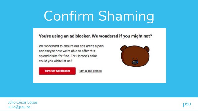
It’s amazing when I see job postings for UX writing positions and part of the requirements are “3-5 years UX writing experience”. I don’t think it’s dawned on most companies yet that UX writing isn’t exactly an ancient profession. In fact, it’s so new that as of last check, Glassdoor doesn’t even recognize it as an official job title.

So what gives? UX writing is a new discipline combining some elements of copywriting, content writing, and a little UX design. The definition, or at least my definition, is that it’s the art writing professional copy for a digital product with a purpose to engage and interact with the user.

That means that every piece of content a UX writer creates has to have a distinctive purpose to keep it’s user engaged through a design process; in most cases this means the copy you see on an app or mobile platform.

Because UX writing is such a new profession, there is a limited amount of resources or references for how to develop the craft. After all, there’s no UX writing degree, or even certification at this point.

How do you break into UX writing?

The most obvious answer is to work in house at a company that engages with digital products. If you’re working for a company with an app or website, it’s likely that you already have a UX writer (even if it’s not exactly called that). For many people, it usually starts by accepting a role as a digital marketer, copywriter, or even UX designer, and gradually shifting the focus or responsibility to UX writing specifically.

But what about the people just trying to break into the field from a clean slate?

Many design and technical schools now offer UX Writing specific courses to educate people on the craft of UX writing. Some colleges now offer it as well.

But if you’re looking for some online material, here’s the best I found personally:

3 Online Resources on UX Writing

  1. Microcopy: The Complete Guide by Kinneret Yifrah. This is the definitive UX Writing copy book according to many others in the field, including myself. Kinneret does a masterful job breaking down the purpose behind each UX strategy, and how UX Writers can maximize their impact.

  2. Facebook Groups. This might not sound like the best place to go for writing tips, but there are a few solid Facebook groups dedicated to UX writing that I think pay off wonderfully. I have not only received a job offer through connections I’ve made in one, but have also learned valuable insight and expertise by some of the best in the field.

  3. Medium. Hands-down the most important and viable platform to receive helpful tips, industry expertise, and staying ahead of current trends and news, Medium has something for everyone, at every skill level. Their articles on UX writing far surpass anything you’ll find currently whether in a text book or classroom. I have some articles I’ve written myself which you can read here: https://medium.com/@leonardraymundo

As with anything, UX Writing is a discipline that requires a little of professional insight mixed with a little first-hand experience and experimentation. Thankfully, there are a number of ways to get professional expertise without the need to fork over thousands to a university. I suggest starting out by networking on Facebook or LinkedIn, and take at least an hour each day to learn about the process of UX writing, depending on how serious about it you want to get.

Hopefully you’ll find these as useful as I have.

In Copywriting Tags ux writing, ux design, Copywriting, content strategy

UX microcopy: finding a balance between empathy and humor

February 11, 2019

Photo by Tim Mossholder on Unsplash

If I learned anything from Pixar in the last decade, it’s that life is complicated and often requires a balance of joy and sadness to make it through the tougher times (Inside Out, you get me).

Whether you’re in the writing/design field, or someone who deals with customers on an ongoing basis, the key to creating memorable experiences starts with putting yourself in your users’ shoes.

The trick, of course, is getting it right, and getting it right is usually what separates the best brands from the worst.

Empathy and humor aren’t necessarily in opposition of each other in most respects, but with microcopy, there’s a balance that often needs to be struck when the writer goes through their decision-making process.

Humor

Making people laugh is arguably one of the hardest things to do in the world. Legendary comedians like Dave Chappelle, Hasan Minaj, Ali Wong, and Conan O’Brien, are all naturally talented at telling jokes through storytelling, and it always makes them more relatable to their audience.

Humor is, of course, subjective, and when it comes to humor in UX, it can be even more so. UX writing is probably not the place you want to tell that mama joke your little cousin told you, so understanding the type of humor you need for your brand voice and tone is the first step to creating great microcopy.

Empathy

Unlike humor, empathy is pretty universal. We don’t need much to tell someone we’re sorry, or apologize when we’ve done something wrong. The act of contrition is usually enough, but finding the right words can make a difference between a positive and a generic experience.

Poor empathy results in not only in losing customers, but people generally staying away from your brand due to tone-deaf lack of awareness.

Here’s an example of getting both humor and empathy incorrect, as is the case for most forms of “confirm shaming”.


Also fwiw, don’t use animals as props to insult please

Also fwiw, don’t use animals as props to insult please


Confirm shaming might seem like a clever way to endear yourselves to your audience, but there’s been a wave of online rebellion against these predatory tactics, and as content creators you should be aware of this.

Here’s a few more microcopy examples that you may have seen across the internet:

Deleting Stuff

There’s an ongoing joke in the UX community about some of the early days of awful UX writing, and sort of like the crying Jordan meme, they never get old.


0_blgouQnd9g4Sjw3_.png

To be fair to the programmers who likely wrote this, if writers tried to write code in the 90’s I’m sure the result would’ve been much worse.

It’s inspired some of us UX writers to create our own inside microcopy jokes that can give us some levity in times of need.


Hey, we’re not all Dave Chappelle okay?

Hey, we’re not all Dave Chappelle okay?

The big guys aren’t innocent from poor UX writing either. Apple is great at a lot of things, but this little bit of microcopy isn’t so much:


Clear as mud

Clear as mud

That’s a lot of copy to say that you might want to transfer some data to your iTunes library before updating.

Also, if updating means you lose all unsaved/transferred data, it’s going to suck if the customer presses continue, and finds out later their Taylor Swift albums have all been deleted to eternity.

A Better Approach

Generally, cancellations and deleting stuff aren’t ideal situations for quipping out your best one-liners. More often than not, these actions can’t be undone, so clarity is more important than reinforcing your brand voice.

So now we focus on clarity, and that’s what EventBrite did with this copy:

1_bwUaR9Fj8DiUCq_t2iRlYw.png

Okay now it’s suuper clear, but I’m still not a big fan of how many times “cancel…order” appears. This might be a case of too much clarity (ie: repetitiveness) and copy.

I would make the subheading the main headline and make it easier.

One less “cancel order” line

One less “cancel order” line

So now we have a concise message that also emphasizes clarity by making it the only copy that stands out.

To add the right touch of empathy, I would write a secondary screen to confirm the cancellation, and add a message that says something along the lines of “Your order has been cancelled. If you’d like to leave a comment, please write us below. Otherwise, we hope you stay in touch!”

404 Error pages

Error pages used to be a point of major frustration, but thankfully with the infusion of more UX writers and copywriters on design teams, we’re seeing less and less error messages written like this one:

1_4wFC78MHgCe-n_8YYpAXtg.png

Fixing the Error Message

When possible, describe the specific error message to the user as best as possible, and offer some constructive ways for them to find their way back. Privately, error pages are some of the most fun things for UX writers to work on, because it gives us a chance to emphasize our brand voice, while writing a clear message that helps the user understand the issue.

While it’s important to be empathetic to the frustration of an error message, we can generally afford to have a little more fun, as they don’t cause any permanent damage or irrevocable actions.

Here’s how Pixar does it:


Thought you’d make it through without another Inside Out reference? You thought wrong.

Thought you’d make it through without another Inside Out reference? You thought wrong.

Meanwhile AirBnB has a charming little animation, as well as some helpful links to get the user back on track.

1_E_fIt7IcIjuP-6aYXiiVOg.png

Error screens and/or empty states are a great way to inject your brand voice into an otherwise negative or confusing experience. But if you have to prioritize, make sure it’s clarity first, subtle humor second.

Signup and invalid log-in screens

Sign-ups are a first touch point for many users, so the tone you set here has a high impact on the customer journey. Many brands take a typical “Wrong username or password” message if you try to log-in with the incorrect credentials, and there’s certainly nothing wrong with that (other than, why not be more specific-is it my username or password?).

But if your style guide and product can make it work, why not use a little brand voice to reinforce your identity?

Trello’s sign up process is not only quick and easy, but a delight for any casual to hardcore X-files fans:

1_xRh1kCfVQXflImiIj8k56A.png

The Dropbox brand isn’t exactly known for its hilarity, but that doesn’t doesn’t stop them from using a more playful and personal tone with their log-in error message.


1_QT7rO7y4DI7NAl2LZ2a65Q.png

TeuxDeux manages to incorporate both empathy AND slight humor in this simple, yet effective microcopy:

1_A48C8Gs18EBpgaAEhds5BQ.png

Time to use a style guide?

Knowing when to balance humor and empathy depends on a lot of various factors, influences, and context. There’s no one right way to do it, so it’s important that your brand accounts for various scenario’s, and create a style guide to address them in a way your team will be consistent about.

Mailchimp has one of the best style guides in the industry, and it’s available to anyone to reference.

Welcome to the Mailchimp Content Style Guide | Mailchimp Content Style Guide
Guidelines and resources for web writers and editors. Includes: voice and tone, grammar, web style, social media, email…styleguide.mailchimp.com

Here’s what they have to say about humor:

Our humor is dry. Our sense of humor is straight-faced, subtle, and a touch eccentric. We’re weird but not inappropriate, smart but not snobbish. We prefer winking to shouting. We’re never condescending or exclusive — we always bring our customers in on the joke.

Specific, yet open enough for any creative writer to use their best judgement in any given scenario.

Moral of the story-adjust your brand tone to the user’s experience

Most brands tend to play it safe with their humor, and not safe enough with their empathy. I say if your writing is genuinely funny, go for it. Just be sure to do so with the user, all users that is, in mind.

Many of my references in this article are thanks to Kinneret Yifrah for creating the “bible” of UX writing called “Microcopy: The Complete Guide”. Get it now at http://www.microcopybook.com/

In Copywriting Tags ux writing, ux design, visual design, copywriting, error pages, branding
Comment
0_7OqKnvtvbE4yIb6l.jpg

Why I’m Making the Transition from Copywriter to UX Design

September 20, 2018

This is a repost from my article on Medium, published by The Writing Cooperative.

I can hear my super traditional Filipino mom criticizing me for making yet another career “transition” at this point in my life, wishing that I would stick to one thing and be really great at it, and staying with one company for the rest of my adult American privileged life. Well mom, I’ve spent the past 5 years or so developing my copywriting craft…attending school, following blogs, working at agencies…all to further my development. And guess what? It’s time for me to evolve. 

Also, please let me know when you’re making some sinigang again. 

I made the decision that this fall I will be attending classes at General Assembly in Seattle to study UX Design. 

Why? Well for one, papa needs a little more money. UX designers make over 100k in Seattle according to Glassdoor, and I like the sound of that. I like that a lot. 

It’s also a pretty common industry to get into for people my age or slightly older. 

Most importantly though, it’s because I don’t believe it’s actually much of a career change at all. There are quite a few similarities between the two career paths (graphic designers are in this boat as well) that make it seamless. 

What similarities you ask? Well here’s a few for starters:

  1. Know your users. Copywriting, as well as UX design, graphic design, and many other disciplines, starts with knowing your users/customers. By narrowing your field of focus to a target set of users, and not just everyone, you’re solving a specific challenge to a specific set of people. This involves both quantitative and qualitative ways to looking at research to determine root cause.

  2. Techniques of persuasion. This may be more of a copywriting thing, but knowing how to position your products/service is the core tenant of copywriting. You want X, we have Y as a solution to your problem. Knowing which emotions/logic to invoke is part of what makes an effective copywriter. UX can be similar, but I would say UX focuses a little more on how to make the experience easier for the user to find what they want. Either way, they’re both about improving experiences.

  3. Visual Creativity. I get this question a lot as a copywriter; “Don’t you just write words?” No, Mr.Condescending tool bag, we don’t just “write words”, we develop ideas and concepts to effectively convey a product/service. A lot of times that means developing the right imagery/illustrations to highlight the point. UX also involves visual aids, and a proper UI designer will boost that point even further. 

  4. Mapping the journey. Every user goes through a customer journey map which is the 2018 way of saying that marketing is a series of decision points. People don’t just see an ad and buy anymore, there’s a whole in between process that we must account for. Both copywriting and UX design play a key role in fleshing out the details of that path. It involves content, and discoverability, knowing where your customers consume information, and knowing how they expect to find more if they need to.

I can’t wait to start my formal training and I’ve already started the usual rounds of YouTube, Skillshare, and textbooks to get me started. If you’ve went through a similar transition or have some helpful tips (and not “don’t you just write words”) than I’d love to hear em. Thanks and wish me luck. 

This is a repost from my article on Medium, published by The Writing Cooperative.

In Copywriting Tags ux design, ux copywriter, ui design, ux school
Comment
1_3ck5wQHiF1mH5y28yM-xZw.jpeg

Stop Advertising and Start Captivating: How to Better Target Your Audience

August 16, 2018

Now that 2018 is right around the corner, we are beginning, yet again, a new age of digital advertising.

Even the word ‘advertising’ still gives people bad vibes, thanks a lot Don Draper. Just think about that 30 second, unskippable video popping up telling you to buy car insurance when all you are trying to do is watch that new Kendrick Lamar video that's trending on the Twitter-sphere. And don't even get me started on mobile devices, where ads can simply become unwatchable.

Is it just me, or do these new ads scream desperation? The unskippable ads and and online pop-ups only cause frustration for those of us trying to consume content faster and easier than ever before. One could argue that failed attempts at creating effective online ads are actually hurting a company’s brand.

So the questions remains- how do advertisers survive now that old age tactics are starting to die off?

My answer: Engage

No one likes the car salesmen “in your face” approach, and advertisers that do so are likely to be met with less website traffic and fewer sales. Creating engaging content is what advertisers and businesses need to do in order to stay afloat in the world of digital communications. It's a concept marketers like to call "Lead-Gen Marketing".

Take one of my personal faves, The Most Interesting Man in the World for example. Dos Equis took a simple approach that actually played on an older idea (if you’re familiar with the Chuck Norris jokes) , and added some perfectly relevant, hilarious one-liners being created in every commercial such as, “mosquitos refuse to bit him purely out of respect,” “his two cents is worth $37 in change,” and “if he were to pat you on the back, you would list it on your resume.” Of course it would end with a Dos Equis beer plug, which is a genius and highly effective marketing tactic, because it held people’s attention.

The internet immediately fell in love with this advertising campaign. He quickly became a meme, which is the holy grail for advertisers, and the company saw an increase in sales soon after the commercials were first aired. The key to this campaign’s success was its engagement to its audience. Customers enjoyed the commercial’s quirkiness. It was entertaining. Its humor related to a younger crowd, and many people within that demographic shared it across social media, increasing its reach even more. Perhaps the most impressive thing for me, was how it connected the humorous juxtaposition with the brand itself, without coming across as them trying to shove sales down your throat.

Now that Generation Z is beginning to make a larger online presence, advertisers must take into consideration that this means more people who simply despise ads. Though it will always change throughout time, effective advertising campaigns must look at the bigger picture and try and get their audience to engage with their brand, rather than their products. I feel like that bears repeating so I'll say it again for the people in the back:

"Engage with their brand, rather than their products"

Stay on top of the demographic shifts your target audience is into, and think about making something that is genuinely worth watching, rather than peddling some ads out there because "we need more social media". 

In Copywriting Tags dos equis, advertising, generation z, lead-gen marketing, digital advertising, seattle copywriter, social media marketing, thought leadership
1_Wb_NhYcIVtE9-kEntDozTQ.jpeg

Ready Player One demonstrates there’s such thing as too much Marketing

April 3, 2018

(This is a repost from my Medium blog which you can find here)

Ready Player One has not had a good marketing campaign thus far. To say it’s been rocky might be downplaying it a bit.

Based off the Ernest Cline novel of the same title, Ready Player One is a movie set in the not too distant, dystopian future about a teenage boy who becomes obsessed with solving an elaborate puzzle within the OASIS, a hyper-real virtual reality simulation, where the eventual winner wins a crapload of money.

It’s not a terrible premise, and considering that the book wasn’t exactly the Great Gatsby of its era, it really didn’t have a high benchmark for expectations. Helmed by Steven Spielberg, it could still very well become a great movie, it’s just…..well, the movie is already on the cusp of a box office implosion due to its shaky trailer, social media backlash, and poor marketing efforts.

Let’s examine, starting with the problematic trailer:


The trailer is chalk-full of what some people might consider “Easter Eggs”-an intentional message, joke, or nod to fans who may get a reference to earlier work.

Except, when executed poorly, Easter Eggs can creep into another territory altogether.

It’s a concept called “Intertextuality”, which was masterfully covered by the Nerdwriter over on YouTube.

He defines intertextuality as “something in a movie that is shaped by another text, usually another movie, or book, or play”. Basically, it’s a cultural reference to something outside of the movie. He goes on to argue that films are increasingly using intertextual references as a substitute for emotion or solid storytelling.

Because intertextuality isn’t a bad thing in itself, but when incorrectly used, or in the case of this trailer, overused, it can leave audiences feeling dull, flat, and worst of all….bored.

If at any point during this trailer you said to yourself, “Hey, I know that thing” then you just experienced weaponized intertextuality.

How Ready Player One abuses its intertextual ancestry

Yes, I’ve read the book, and I realize that the book is also structured around its sentimentality ridden narrative, possibly subverting the hero’s expectations as it relates to his obsession with video game culture and nostalgia.

But that doesn’t excuse the marketing teams behind Ready Player One for absolutely going HAM on their audiences expectations of intertextuality. Instead of going for something more subtle, they simply photoshopped old, classic movie posters and substituted the stars of Ready Player One on top of it like it was some sort of crying Jordan meme.

How to conjure up nostalgia the right way

I can think of two specific examples of intertextuality working the way it should be. The first most obvious choice, is Stranger Things. The genius about Stranger Things is that while it relies pretty heavily on 80’s references, it doesn’t use it as a substitute for story. At it’s heart, Stranger Things is really about a group of kids trying to find their way through adolescence, against the backdrop of an interdimensional threat that threatens their way of life. That story isn’t about the 80’s. The 80’s are merely the supporting character.

The 80’s weren’t that bad kids

Another great example is one of my favorite comic book movies of all time, Logan.

Comic books aren’t real kids

In Logan, there are definitely references to the comic books, and previous X-men movies. But the story isn’t bogged down by these references, and most importantly, the director James Mangold intentionally didn’t want to go down the path of creating just another superhero movie.

That’s because most superhero movies are guilty of weaponized intertextuality. How many times has a friend leaned over to you in the theater and said “Ooh, a character I know from the comic books!” or “ooh, I bet that’s an easter egg for the next movie!”

Constant character references from obscure comic book issues and movies that serve as an appetizer for bigger, better movies, don’t really make a good movie in itself, do they?

All this is to say that in the modern age of filmmaking and marketing, we need to be smarter about how to connect with and resonate with audiences. People love being reminded about their past, but in a way that’s not shoved in their face, and right on the nose. Because just like advertising, people do not fall in love with products, references, or easter eggs, they fall in love with a feeling.

In Copywriting Tags ready player one, marketing, digital marketing, advertising, hollywood, movie marketing
1 Comment
Older Posts →

Latest & Greatest

Featured
Jul 16, 2019
Why you're looking for a web designer, but need a UX designer
Jul 16, 2019
Jul 16, 2019
Mar 19, 2019
3 Must Have Resources for a UX Writing Career
Mar 19, 2019
Mar 19, 2019
Feb 11, 2019
UX microcopy: finding a balance between empathy and humor
Feb 11, 2019
Feb 11, 2019
Sep 20, 2018
Why I’m Making the Transition from Copywriter to UX Design
Sep 20, 2018
Sep 20, 2018
Aug 29, 2018
Crazy Rich Asians Box Office Success is Less Want And More Need
Aug 29, 2018
Aug 29, 2018
Aug 16, 2018
Stop Advertising and Start Captivating: How to Better Target Your Audience
Aug 16, 2018
Aug 16, 2018
May 8, 2018
Why Kanye West sadly reminds me of another celebrity of color
May 8, 2018
May 8, 2018
Apr 3, 2018
Ready Player One demonstrates there’s such thing as too much Marketing
Apr 3, 2018
Apr 3, 2018
Feb 5, 2018
Striking the Right Tone with Super Bowl Ads
Feb 5, 2018
Feb 5, 2018
Jan 11, 2018
What Hollywood can teach us about advertising
Jan 11, 2018
Jan 11, 2018