
Photo by Tim Mossholder on Unsplash
If I learned anything from Pixar in the last decade, it’s that life is complicated and often requires a balance of joy and sadness to make it through the tougher times (Inside Out, you get me).
Whether you’re in the writing/design field, or someone who deals with customers on an ongoing basis, the key to creating memorable experiences starts with putting yourself in your users’ shoes.
The trick, of course, is getting it right, and getting it right is usually what separates the best brands from the worst.
Empathy and humor aren’t necessarily in opposition of each other in most respects, but with microcopy, there’s a balance that often needs to be struck when the writer goes through their decision-making process.
Humor
Making people laugh is arguably one of the hardest things to do in the world. Legendary comedians like Dave Chappelle, Hasan Minaj, Ali Wong, and Conan O’Brien, are all naturally talented at telling jokes through storytelling, and it always makes them more relatable to their audience.
Humor is, of course, subjective, and when it comes to humor in UX, it can be even more so. UX writing is probably not the place you want to tell that mama joke your little cousin told you, so understanding the type of humor you need for your brand voice and tone is the first step to creating great microcopy.
Empathy
Unlike humor, empathy is pretty universal. We don’t need much to tell someone we’re sorry, or apologize when we’ve done something wrong. The act of contrition is usually enough, but finding the right words can make a difference between a positive and a generic experience.
Poor empathy results in not only in losing customers, but people generally staying away from your brand due to tone-deaf lack of awareness.
Here’s an example of getting both humor and empathy incorrect, as is the case for most forms of “confirm shaming”.
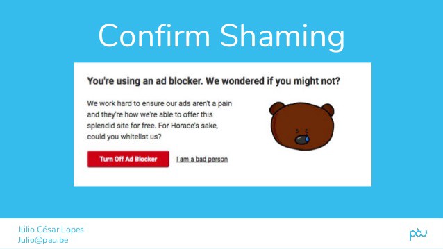
Also fwiw, don’t use animals as props to insult please
Confirm shaming might seem like a clever way to endear yourselves to your audience, but there’s been a wave of online rebellion against these predatory tactics, and as content creators you should be aware of this.
Here’s a few more microcopy examples that you may have seen across the internet:
Deleting Stuff
There’s an ongoing joke in the UX community about some of the early days of awful UX writing, and sort of like the crying Jordan meme, they never get old.

To be fair to the programmers who likely wrote this, if writers tried to write code in the 90’s I’m sure the result would’ve been much worse.
It’s inspired some of us UX writers to create our own inside microcopy jokes that can give us some levity in times of need.

Hey, we’re not all Dave Chappelle okay?
The big guys aren’t innocent from poor UX writing either. Apple is great at a lot of things, but this little bit of microcopy isn’t so much:

Clear as mud
That’s a lot of copy to say that you might want to transfer some data to your iTunes library before updating.
Also, if updating means you lose all unsaved/transferred data, it’s going to suck if the customer presses continue, and finds out later their Taylor Swift albums have all been deleted to eternity.
A Better Approach
Generally, cancellations and deleting stuff aren’t ideal situations for quipping out your best one-liners. More often than not, these actions can’t be undone, so clarity is more important than reinforcing your brand voice.
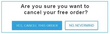
So now we focus on clarity, and that’s what EventBrite did with this copy:

Okay now it’s suuper clear, but I’m still not a big fan of how many times “cancel…order” appears. This might be a case of too much clarity (ie: repetitiveness) and copy.
I would make the subheading the main headline and make it easier.
One less “cancel order” line
So now we have a concise message that also emphasizes clarity by making it the only copy that stands out.
To add the right touch of empathy, I would write a secondary screen to confirm the cancellation, and add a message that says something along the lines of “Your order has been cancelled. If you’d like to leave a comment, please write us below. Otherwise, we hope you stay in touch!”
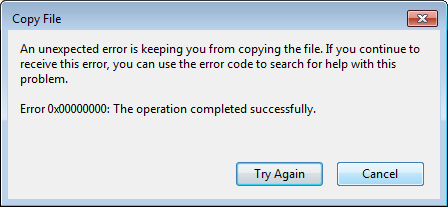
404 Error pages
Error pages used to be a point of major frustration, but thankfully with the infusion of more UX writers and copywriters on design teams, we’re seeing less and less error messages written like this one:
Fixing the Error Message
When possible, describe the specific error message to the user as best as possible, and offer some constructive ways for them to find their way back. Privately, error pages are some of the most fun things for UX writers to work on, because it gives us a chance to emphasize our brand voice, while writing a clear message that helps the user understand the issue.
While it’s important to be empathetic to the frustration of an error message, we can generally afford to have a little more fun, as they don’t cause any permanent damage or irrevocable actions.
Here’s how Pixar does it:

Thought you’d make it through without another Inside Out reference? You thought wrong.
Meanwhile AirBnB has a charming little animation, as well as some helpful links to get the user back on track.

Error screens and/or empty states are a great way to inject your brand voice into an otherwise negative or confusing experience. But if you have to prioritize, make sure it’s clarity first, subtle humor second.
Signup and invalid log-in screens
Sign-ups are a first touch point for many users, so the tone you set here has a high impact on the customer journey. Many brands take a typical “Wrong username or password” message if you try to log-in with the incorrect credentials, and there’s certainly nothing wrong with that (other than, why not be more specific-is it my username or password?).
But if your style guide and product can make it work, why not use a little brand voice to reinforce your identity?
Trello’s sign up process is not only quick and easy, but a delight for any casual to hardcore X-files fans:

The Dropbox brand isn’t exactly known for its hilarity, but that doesn’t doesn’t stop them from using a more playful and personal tone with their log-in error message.

TeuxDeux manages to incorporate both empathy AND slight humor in this simple, yet effective microcopy:

Time to use a style guide?
Knowing when to balance humor and empathy depends on a lot of various factors, influences, and context. There’s no one right way to do it, so it’s important that your brand accounts for various scenario’s, and create a style guide to address them in a way your team will be consistent about.
Mailchimp has one of the best style guides in the industry, and it’s available to anyone to reference.
Here’s what they have to say about humor:
Our humor is dry. Our sense of humor is straight-faced, subtle, and a touch eccentric. We’re weird but not inappropriate, smart but not snobbish. We prefer winking to shouting. We’re never condescending or exclusive — we always bring our customers in on the joke.
Specific, yet open enough for any creative writer to use their best judgement in any given scenario.
Moral of the story-adjust your brand tone to the user’s experience
Most brands tend to play it safe with their humor, and not safe enough with their empathy. I say if your writing is genuinely funny, go for it. Just be sure to do so with the user, all users that is, in mind.
Many of my references in this article are thanks to Kinneret Yifrah for creating the “bible” of UX writing called “Microcopy: The Complete Guide”. Get it now at http://www.microcopybook.com/